Every time you open a brand new box of crayons, you are actually opening a box full of feelings. Think about how you feel when you stand outside on a bright, sunny afternoon. You probably feel energetic, happy, and ready to run around. Now, think about how you feel when you look at a quiet, rainy window or a deep blue swimming pool. You probably feel relaxed, sleepy, and calm.
Colors are not just beautiful things we see with our eyes; they are invisible signals that completely change how we feel inside. Artists and designers have known this secret for hundreds of years. To organize these feelings, they invented a brilliant circle called the color wheel. Today, we are going to spin that wheel and discover how dividing it into two halves can turn your simple drawings into powerful, emotional masterpieces.
What Are Warm Colour Families?
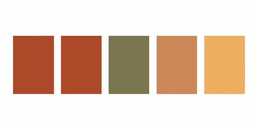
If you look at the right side of the standard artist’s wheel, you will find the warm colors. These are the bright reds, the glowing oranges, and the cheerful yellows.
When someone asks, exactly what are warm colour choices meant to do, the answer is all about heat and energy. These shades trick our brains into thinking about warm things in nature. When you paint with a bright yellow crayon, your mind instantly thinks of the hot summer sun. When you use orange and red, you think of a crackling campfire, glowing autumn leaves, or a spicy chili pepper.
Because they remind us of heat and daylight, these shades make us feel highly active and awake. If you want to draw a fast sports car, a powerful superhero, or a happy summer picnic, using these energetic shades will make your artwork feel incredibly alive.
Read More – Teaching Colors To Kindergarten Kids
Exploring Cool Colours
Now, let us flip the wheel completely upside down. On the opposite side of the circle, you will find the cool colours. This family includes the deep blues, the fresh greens, and the soft purples.
Just like the heated shades remind us of the sun, these shades remind us of the quiet, refreshing parts of nature. Blue makes us think of the wide ocean or a clear winter sky. Green reminds us of soft grass, tall trees, and shady forests. Purple brings to mind the quiet evening sky just after the sun goes down.
These shades are nature’s way of telling us to slow down and take a deep breath. They bring a wonderful sense of peace and relaxation. If you are drawing a sleeping baby animal, a quiet fish pond, or a magical nighttime forest, leaning heavily on this side of the wheel will make your drawing feel wonderfully peaceful.
Warm and Cool Colors
The real magic of art happens when we start mixing the two families together. Understanding the relationship between warm and cool colors is the ultimate secret weapon for any young designer.
Imagine you are looking at a plain blue piece of paper. It looks nice, but it is very quiet. Now, imagine putting a single, bright orange sticker right in the middle of that blue paper. Suddenly, the orange sticker looks incredibly bright, almost like it is glowing! This happens because of a design trick called contrast.
When you place warm colors and cool colors right next to each other, they make each other look much stronger. The cool background makes the warm object pop out, and the warm object makes the background look even deeper. Artists use this trick to tell you exactly where to look. If they want you to look at a brave knight in a painting, they might paint the knight’s shield a bright, warm red, and paint the entire background a quiet, cool blue.
Read More – Color Activities for Kids
Designing Your Own Masterpiece
You can use these rules to decorate your own world. If you were allowed to paint your bedroom any way you wanted, how would you use the color wheel?
Since a bedroom is a place for resting and sleeping, painting the walls a loud, bright red might keep you awake because it is full of active energy. Instead, painting the walls a soft, cool blue or a gentle green helps your brain relax and get ready for bedtime. But, you can still add a bright yellow pillow or an orange lamp on your desk to give the room a tiny pop of happy energy when you need to do your homework!
Conclusion
To summarize our artistic journey, the color wheel is much more than just a rainbow drawn in a circle. It is a brilliant map of human emotions. By simply dividing your crayon box into the bright, energetic side and the quiet, relaxing side, you take total control over how people feel when they look at your art.
Understanding these color families leaves us with a truly thought-provoking realization. Colors act as a silent language that absolutely everyone in the world can understand. You do not need to write a single word on your paper to tell a story about a hot, exciting adventure or a quiet, chilly mystery. You just need to choose the right crayon, trust your feelings, and let the colors do all the talking.
To read more fun and educational articles, check out the EuroKids Blog, and visit our website for details on EuroKids Preschool Admission.
FAQs
Are black and white considered warm or cool?
No, black, white, and gray are considered “neutral” colors. They do not have a temperature on their own, but they are incredibly useful for making other colors look darker or lighter!
Can a color be both warm and cool?
Yes, it depends on how it is mixed! For example, a yellow-green looks very warm because of the yellow, but a blue-green looks very cool.
Why do fast-food restaurants always use red and yellow signs?
Restaurant designers know that these specific warm shades give people lots of energy and actually make them feel hungrier and eat faster!
What is the easiest way to remember the order of the color wheel?
Just remember the funny name “ROY G. BIV”! It stands for Red, Orange, Yellow, Green, Blue, Indigo, and Violet.